The Explore feature in Google Sheets helps you gain insight from the data in your spreadsheets with the power of machine learning. Explore automatically analyzes everything in Sheets to make visualizing data easier.
Explore for Sheets takes away a lot of the stress and guesswork when you deal with large data sets in your spreadsheet. Simply open it and choose a suggested chart, graph, or pivot table to insert into your spreadsheet. You can also “ask” to create charts that are not automatically suggested.
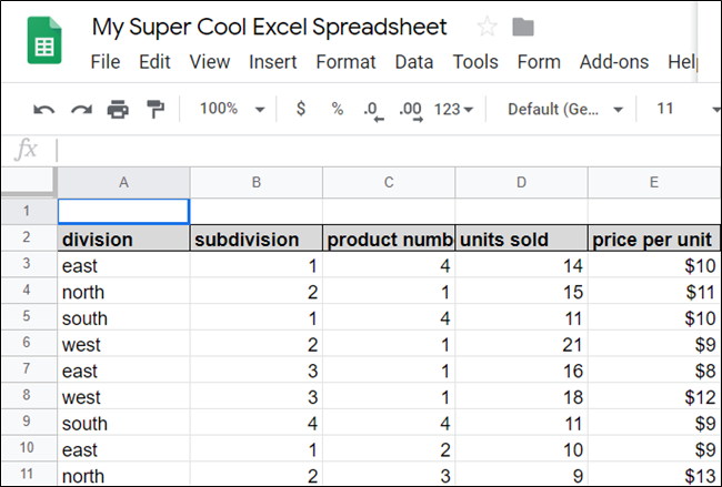
To get started, fire up your browser, head to your Google Sheets homepage, and open a file with a few data sets.

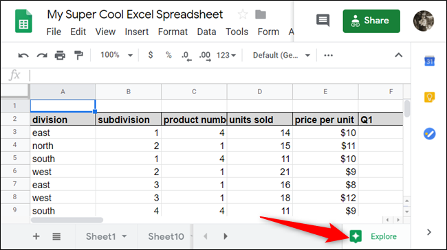
In the bottom-right corner, click “Explore” or use the Alt+Shift+X (Windows/ChromeOS) or Option+Shift+X (macOS) keyboard shortcut to open the Explore pane.

By default, Explore analyzes the whole sheet’s data sets, but you can isolate specific columns or rows if you highlight them before you click “Explore.”
When you open Explore, you see four sections: “Answers,” “Formatting,” “Pivot Table,” and “Analysis.” In “Formatting,” you can change the color scheme of your sheet with the click of a button, and in “Pivot Table,” you can insert a pivot table into your spreadsheet. We’ll focus on “Answers” and “Analysis.”
At the top, under the “Answers” section, you see a few suggestions under the text box—which we’ll cover later. These questions are produced by the AI as optional ideas to get you started; click a link to preview one of the questions the AI conceived.
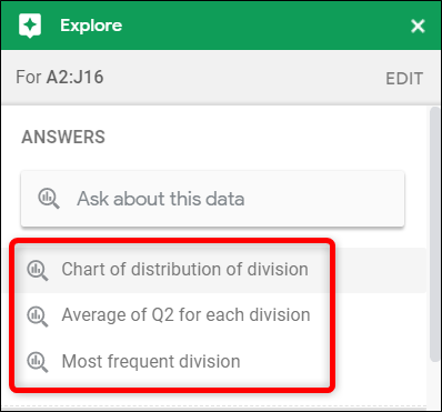

After you click a suggested question, Explore automatically creates a chart based on the criteria listed. In this example, it created a column chart to show sales by division.
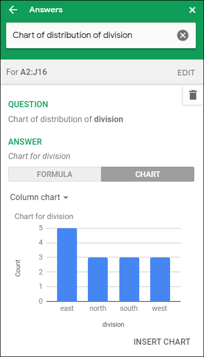

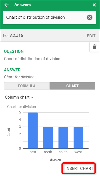
To insert the chart into your spreadsheet, click “Insert Chart” at the bottom of the pane.
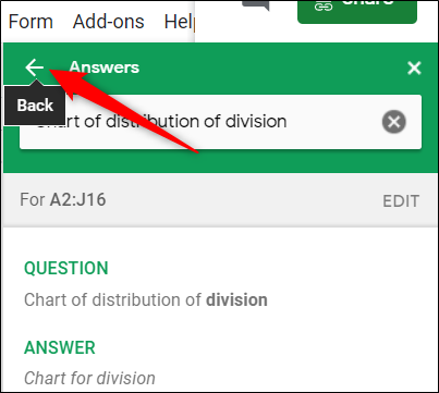
If this isn’t the chart you want, click the Back arrow to see the other suggestions available.

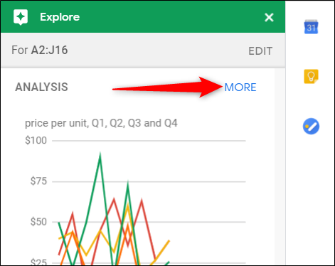
Scroll down until you see the Analysis section. Here, you’ll find premade charts and stats from the data sets you chose earlier. Explore analyzes this data, and then chooses the best way to view it as a chart.
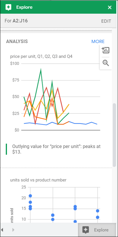

To preview a chart and insert it into your spreadsheet, click the magnifying glass or the plus sign (+), respectively.
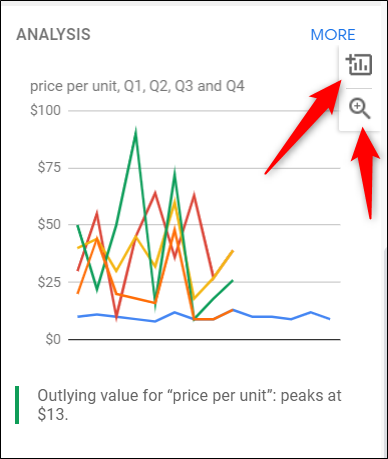

If you click “More,” you see a few other charts and graphs that didn’t fit in the Explore feature pane.

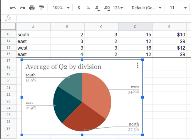
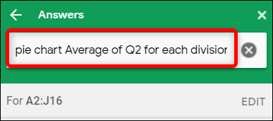
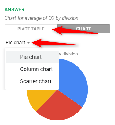
If none of the questions or premade charts will work, you can type a custom query in the text field at the top to get a specific answer. For example, if we want to see each division’s average sales for Q2 in a pie chart, we can type, “Pie chart average of Q2 for each division,” into the text field and press Enter.

Just like that, a pie chart is created showing the average Q2 sales by division.
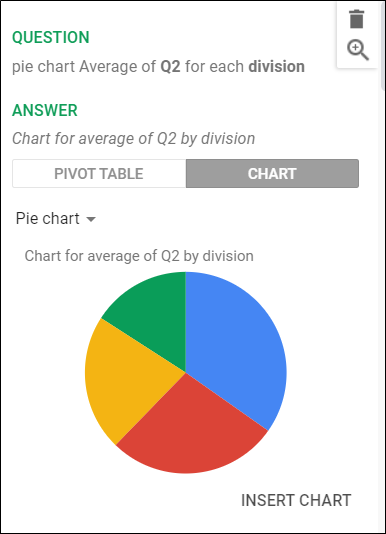

Depending on the data you choose and how it’s displayed, Explore might have a few other charts to view your data sets. You can click “Pivot Table” or “Chart” and select the type of chart you want from the drop-down menu.

To insert a chart into your spreadsheet, simply click “Insert Chart” under the current selection.
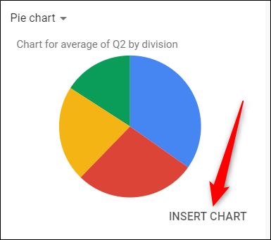

Your chart then appears in the current sheet. You can move and resize it however you want.