


Pivot tables let you analyze large amounts of data and narrow down large data sets to see the relationships between data points. Google Sheets uses pivot tables to summarize your data, making it easier to understand all the information contained in your spreadsheet.
What Are Pivot Tables?
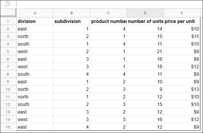
Pivot tables are handy for analyzing massive amounts of data. Where a regular spreadsheet uses only two axes—columns and rows—pivot tables help us make sense of the information in your spreadsheet by summarizing any selected columns and rows of data. For example, a pivot table could be used to analyze sales brought in by divisions of a company for a specific month, where all the information is randomly entered into a dataset.

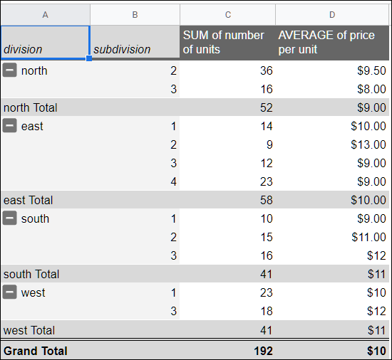
Creating a pivot table from the information in the picture above displays a neatly formatted table with information from selected columns, sorted by division.

How to Create a Pivot Table
Fire up Chrome and open a spreadsheet in Google Sheets.
Next, select any of the cells you want to use in your pivot table. If you’re going to use everything in your dataset, you can click anywhere on the spreadsheet, you don’t have to select every cell first.

Note: Each column selected must have a header associated with it to create a pivot table with those data points.
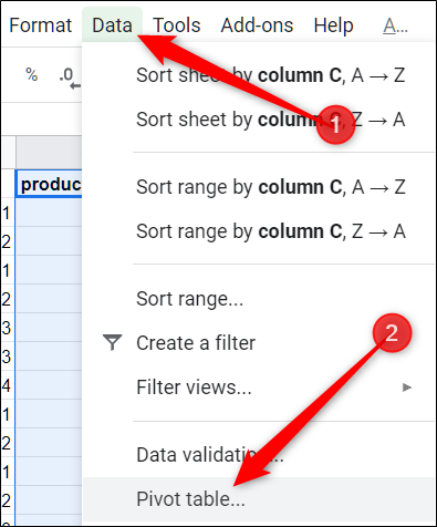
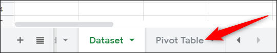
On the menu bar at the top of the page, click “Data,” then click “Pivot Table.”

If the new table doesn’t open automatically, click “Pivot Table,” located at the bottom of your spreadsheet.

How to Edit a Pivot Table
From the pivot table sheet, the side panel lets you add rows, columns, values, and filters for viewing your data. Sometimes, Sheets offers up suggestions based on the information you chose. Click a suggestion or click “Add,” located next to any of the other options below.
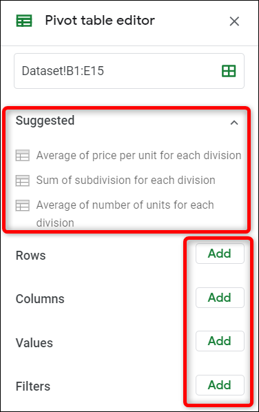

When you click on any of the suggestions, Sheets automatically builds your pivot table using the option you selected from the list given.
If you’d rather customize a pivot table to for your own needs, click any of the “Add” buttons next to the four options below. Each option has a different purpose, here’s what they mean:
- Rows: Adds all unique items of a specific column from your dataset to your pivot table as row headings. They are always the first data points you see in your pivot table in light grey on the left.
- Columns: Adds selected data points (headers) in aggregated form for each column in your table, indicated in the dark grey along the top of your table.
- Values: Adds the actual values of each heading from your dataset to sort on your pivot table.
- Filter: Adds a filter to your table to show only data points meeting specific criteria.
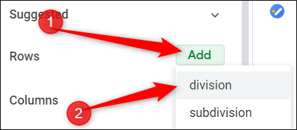
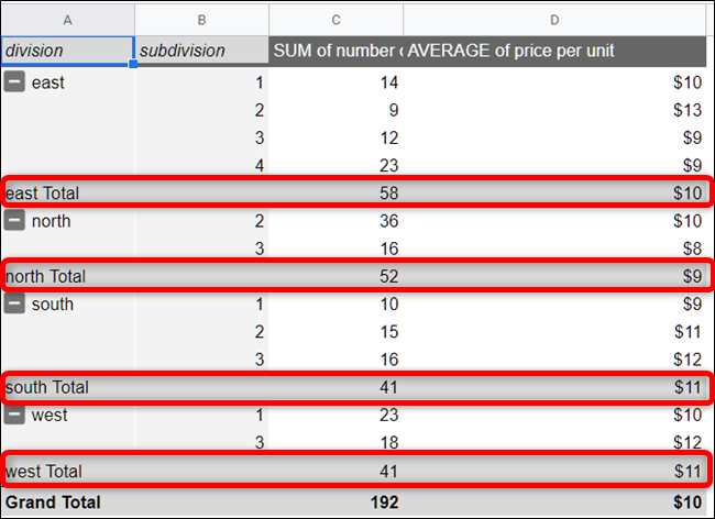
Click on “Add” next to Rows and add in the rows you want to display in your pivot table. For this example, we’ll be adding division and subdivision.

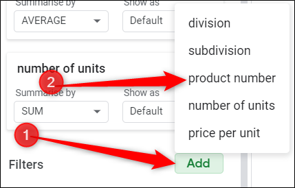
Next, click “Add” next to Values As and insert the values you want to sort information. We’ll be using the sum of the number of units sold and the average price per unit.
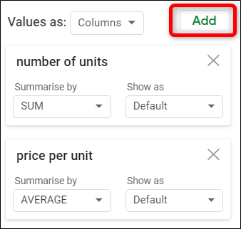

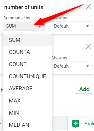
To change the sorting of each unit, click the drop-down menu, located under the heading “Summarise by.” You can choose from the sum, count, average, min, max, among others listed below.

After adding all rows, columns, values, etc. what we’re left with is an easy to read pivot table that outlines which division sold the most units and the average cost of all units sold.

If you’d prefer to make your own formula, click “Add” next to the Values as heading, then click “Calculated Field.”
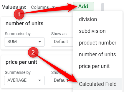

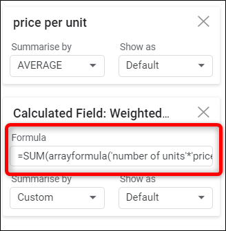
From the new value field, enter a formula that best summarises the data in your pivot table.

If you want to add a filter to your table, click “Add,” located next to the Filters heading.

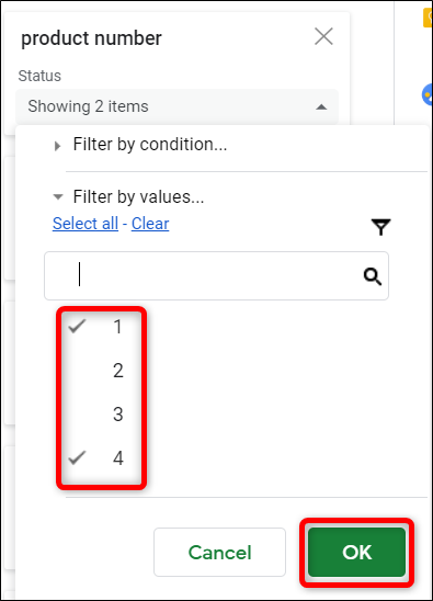
When adding a filter to your table, select—or deselect—the values you want to show on your table, then click “OK” to apply the filter.

That’s all there is to it. Although this is just an introduction to using pivot tables, there is a seemingly endless amount of possibilities for utilizing this feature that not many people know much about.

